RB Rebrands As Reckitt
RB has rebranded (again), this time as Reckitt.
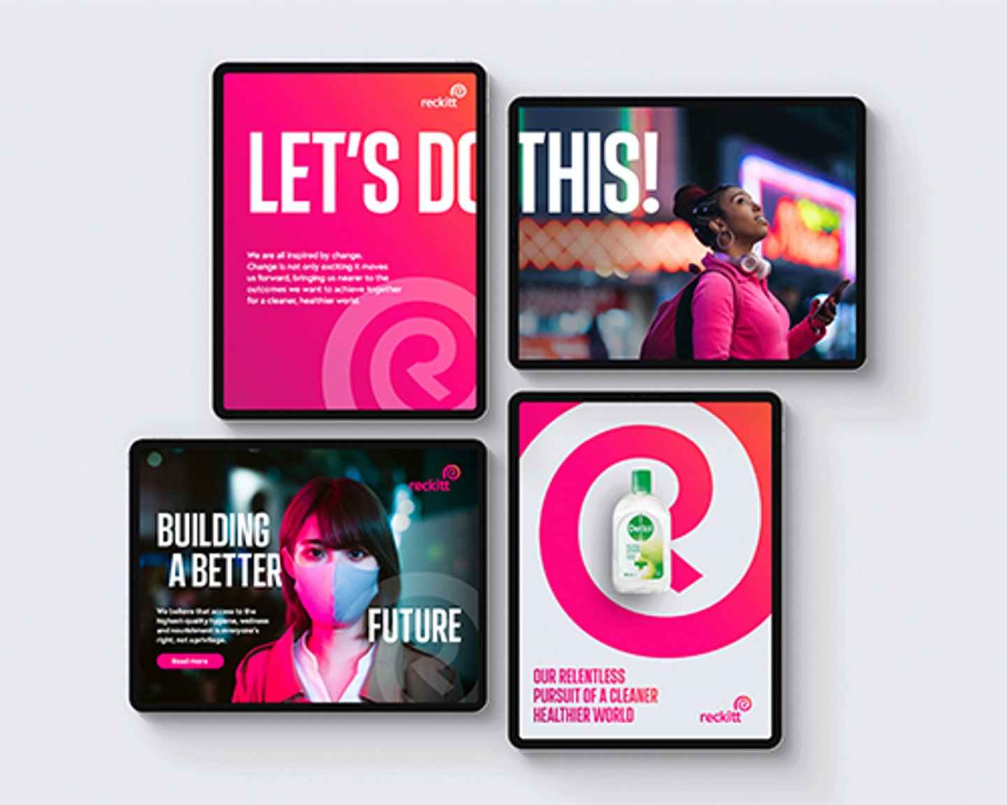
The No. 37 consumer goods company said the new brand identity and logo will be more recognizable, developed on its purpose “to protect, heal and nurture in the relentless pursuit of a cleaner, healthier world.”
The shell-like logo is designed to evoke a sense of protection and serve as a reference to the natural world.
“The brand is a visible symbol of our corporate purpose and the change that has been taking place across the business on our journey of transformation,” said Miguel Veiga-Pestana, senior VP, corporate affairs and sustainability, in a statement. “The name reflects the existing widespread usage of Reckitt and is clearer, simpler and more memorable, while retaining positive associations with the company’s heritage.”
The company rebranded itself to RB, from Reckitt Benckiser, in 2009.
The new branding is expected by the company to help drive more recognition for the brands in its portfolio, which includes such names as Lysol, Dettol, Nurofen and Durex.
“Our new Reckitt identity will better enable us to communicate our corporate purpose to the world, and to do so in a way that is powerful, consistent and impactful,” said Jo Osborn, VP of internal communications and corporate brand.
The rebrand, which will roll out across all of the company’s touchpoints, was created and overseen by Havas’ branding agency Conran Design Group. It will be delivered over a three-year timeline.


