Publix Embraces Wellness Icons

Publix has been increasingly drawing attention to its wellness icons and shelf tags to help shoppers efficiently locate and explore products as well as personalize shopping trips to fit their individual dietary needs or preferences.
The grocer’s mission to elevate healthier food options both in stores and online doesn’t end with wellness icons. The retailer also is reaching health-centric shoppers through a number of ways such as elevating its dietitians' roles and including healthier recipes in its Aprons cooking classes (to name a couple), though the wellness icons serve as a sort of foundation as they pop up most places.
Publix introduced the wellness icons and shelf tags over three years ago, but has been particularly elevating them in recent months, both online and in stores, to help shoppers avoid spending too much time scavenging aisles, reading labels or searching the internet for products and ingredients that fit specific diets.
Publix’s wellness icons include:
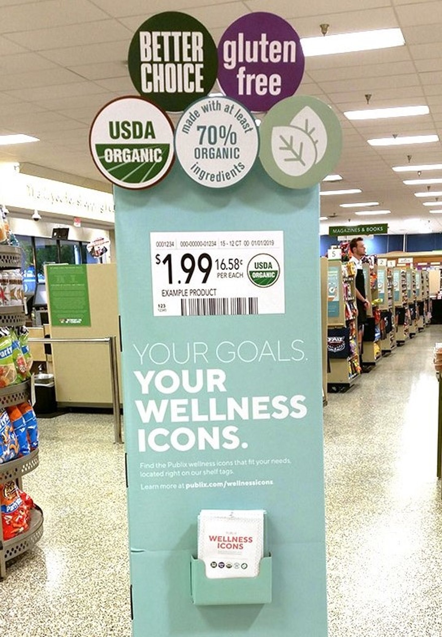
- Better Choice: A green icon that identifies items containing more essential nutrients like fiber and less of what people don’t need in excess like saturated fats and added sugars. According to Publix’s website, its registered dietitians used scientific research to compare products and identify items that fall under this label.
- Gluten Free: A purple icon that identifies products that have been declared gluten-free by the manufacturer according to FDA regulations.
- Leaf: A green leaf icon that represents foods without artificial preservatives, flavors or colors, though they may contain color from natural sources.
- USDA Organic: A green and white icon that indicates USDA-certified organic products or products that are at least 95% organic.
- 70% Organic: A teal and white icon that signifies items made with at least 70% organic ingredients.
The wellness icons have been heavily present in stores as Publix aims to familiarize shoppers with their purposes. In addition to appearing on shelf tags, the icons are depicted on supporting standees, freezer clings, violators, shopping cart signs and other P-O-P materials. Many of the standees also disperse informational handouts describing the icons and their meanings.
Some displays and signage specifically encourage shoppers to utilize the icons. For example, P2PI spotted teal “organic” dump bins in the produce section of one store during the holidays directing shoppers to look for “easy-to-find teal shelf tags throughout the department."
Publix also is offering the information for consumers who are doing more research and making more decisions online.
The grocer is using its website and blog as an extension of its in-store experience, offering more in-depth information as consumers increasingly do more research and make more decisions online. It offers complete lists of ingredients avoided under specific wellness icons, a “Health Center” providing tips and recipes each month, as well as information on how to read a label, dietary concerns, food safety and the retailer's own GreenWise private label.
In early January, a home page carousel ad on publix.com promoted the icons, leading to an informational web page depicting the icons and what they represent. Blog posts from the grocer, social media updates, email ads, two YouTube videos (view more recent one below), display ads and a number of dedicated web pages including publix.com/wellnessicons also promote the icons.
The wellness icons are also used in both digital and print circulars, highlighting products from both national and private label brands, particularly its natural and organic brand (and store format) GreenWise. In fact, Publix deployed a special circular for a “Power of Plants Sale” it ran Jan. 17-23, which touted limited-time savings on plant-based foods, while taking full advantage of the wellness icons.
In other related support, Publix sponsored a content advertisement on WPEC’s “Spotlight on Business” segment, where media and community relations manager Nicole Krauss pitched Publix’s wellness icons on Feb. 12.
Consumers are hungry for more product transparency. According to a September 2018 report from Label Insight and Food Marketing Institute (FMI) dubbed The Transparency Imperative, 86% of shoppers agreed that if food manufacturers or retailers offered complete and easy to understand insight on ingredients, they’d exhibit more trust. 80% said that they’re more likely to be loyal to a brand that offers more in-depth information, beyond what's on the physical label, while 54% are even willing to pay more for said product.
However, the grocer’s icons aren’t just limited to signaling better-for-you options. Publix also has expanded its index to additionally help shoppers identify new products, compare prices quickly and easily identify other categories. They include:
- A blue “New” icon for products new to Publix.
- A red “Save” icon for temporarily reduced items.
- An orange “Clearance” icon.
- A maroon “WIC” icon for items available under the food assistance program for Women, Infants and Children (WIC).
- A maroon “F$A” icon for products allowed to be purchased through a flexible spending account.
- A brown “Local” icon depicting a specific state highlighting local products that were grown, harvested or manufactured in the state where the store is located.
NOTE: For more images of wellness icons at Publix, visit p2pi.org. Path to Purchase Institute members have access to more than 2,330 images and 260 articles of marketing and merchandising activity at Publix, along with a full Retailer Profile outlining the chain’s operations and strategies.
About the Author